Most Mobile Applications use an App Drawer instead of Tabs. Material Designed apps have these primary options, App Drawer or Drawer and Tabs for navigation. But your app has insufficient space to show tabs for navigation. So developers use this widget.
A material design panel that slides in horizontally from the edge of a Scaffold to show navigation links in an application.
Table of content
- How to create an App Drawer in the Flutter
- How to Customise Drawer Design
- Change the Drawer icon in Flutter App
How to create an App Drawer in the Flutter
At first, we create our project. Now we want to show an App Drawer on the left of the App Bar. But This basic drawer is not so attractive. So we will also learn to customize our App Drawer. First, we need to learn how can we create an App Drawer.
If you don’t know how to create a project or application in flutter then check out this blog. Here we describe the flutter installation process to create a project in Flutter.
drawer: Drawer(
child: ListView(children: [
DrawerHeader(
child: Container(
color: Colors.blue,
)),
ListTile(
title: Text("Home"),
),
ListTile(
title: Text("About"),
),
ListTile(
title: Text("Services"),
),
ListTile(
title: Text("Close"),
onTap: () {
Navigator.pop(context);
}),
]),
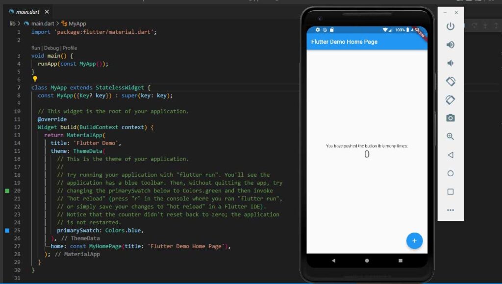
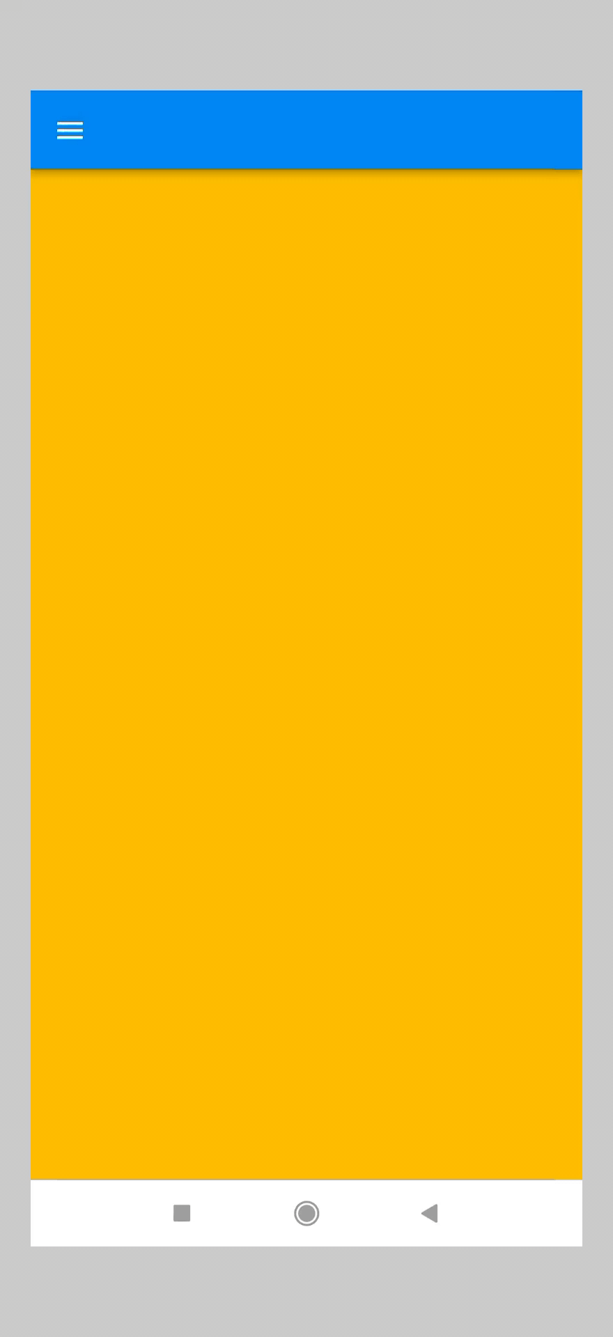
),Step-1: Create Scaffold Widget
After creating our project, we create a stateful widget. In this Stateful Widget, we return a Scaffold Widget. We use Scaffold Widget to create material design layout structures. The Drawer is also its property.
Now we create an app bar, which is also a property of Scaffold. Because when we make a drawer widget it will show its icon in the Appbar.
Step-2: Add a Drawer widget to the Scaffold
Now we add a drawer property to the Scaffold. Then create a Drawer widget. We can see a Menu button visible in our Appbar.
If we press the button, our drawer will open. If we swipe the screen from left to right, the drawer also opens.
Here we create a basic Drawer in the Flutter.
Step-3: Populated the App Drawer with Items
Now we fill the drawer with items. Basically, we use the DrawerHeader widget and some ListTile widgets. And we wrap these two items in ListView Widget. We create Home, About, Services, and Close as ListTiles.
Now ListTile has a property onTap. It is a function. When we tap the ListTile then this function is called.
In Close ListTile, we write a program to Close the drawer. So when we tap this tile, the drawer will close.
Navigator.pop(context);How to Customise App Drawer Design
Now we will customize our drawer and make it more attractive.
Step-1: Create Column Widget and its children widgets in App Drawer
At first, we create a drawer widget. Then we create a column widget in it. In this Column widget, we create two children, drawerHeader, and drawerBody.
 drawer: Drawer(
        child: Column(children: [
          drawerHeader(),
          drawerBody(),
        ]),
      ),
Step-2: Create two Stateless child-Widget as drawerHeader and drawerBody
After that, we create two stateless widgets, drawerHeader, and drawerBody. In these, we return some widgets like Container which we want to display in our App Drawer.
Step-3: drawerHeader design
In drawerHeader, we return a container widget. We provide blue background color. We create a circleAvatar widget for showing an image. And create two Text widgets.
 class drawerHeader extends StatelessWidget {
  const drawerHeader({Key? key}) : super(key: key);

  @override
  Widget build(BuildContext context) {
    return Container(
      padding: EdgeInsets.only(top: 50),
      decoration: BoxDecoration(color: Colors.blue),
      height: 300,
      width: double.infinity,
      child: Column(
        mainAxisAlignment: MainAxisAlignment.center,
        children: [
          Container(
            margin: EdgeInsets.only(bottom: 10),
            height: 100,
            width: 100,
            decoration: BoxDecoration(
              color: Colors.white,
              borderRadius: BorderRadius.circular(55),
            ),
          ),
          Text(
            "Dr. Name Surname",
            style: TextStyle(
                color: Colors.white, fontWeight: FontWeight.bold, fontSize: 17),
          ),
          SizedBox(height: 5),
          Text(
            "Profession",
            style: TextStyle(
                color: Color.fromARGB(255, 24, 24, 24),
                fontWeight: FontWeight.bold,
                fontSize: 13),
          )
        ],
      ),
    );
  }
}
Step-4: Populate the drawerBody
In drawerBody, we create some ListTile widgets as before we have done. We also add icons to each ListTiles.
class drawerBody extends StatelessWidget {
  const drawerBody({Key? key}) : super(key: key);

  @override
  Widget build(BuildContext context) {
    return Container(
      padding: EdgeInsets.symmetric(horizontal: 20),
      child: Column(
        children: <Widget>[
          ListTile(
            style: ListTileStyle.list,
            leading: Icon(Icons.home),
            title: Text("Home"),
          ),
          ListTile(
            style: ListTileStyle.list,
            leading: Icon(Icons.person),
            title: Text("About"),
          ),
          ListTile(
            style: ListTileStyle.list,
            leading: Icon(Icons.settings),
            title: Text("Services"),
          ),
          ListTile(
            style: ListTileStyle.list,
            leading: Icon(Icons.logout_outlined),
            title: Text("Close"),
            onTap: () {
              Navigator.pop(context);
            },
          ),
        ],
      ),
    );
  }
}
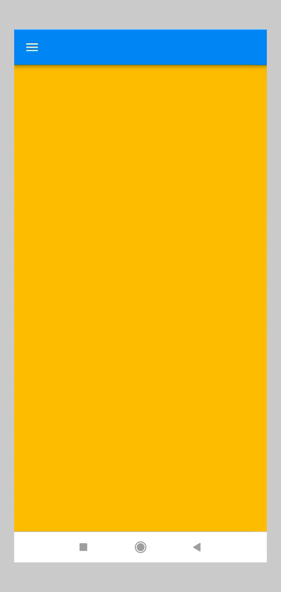
How to change the drawer icon in Flutter
We notice that Flutter has a default drawer icon. There is no such way to change that icon as we change the icons in other widgets. So we change it differently.
Step-1: Create an Icon Button
At first, we create an App Bar. In Appbar we create an IconButton with any icon in the leading widget. Here we use the sort icon.
 appBar: AppBar(
        leading: IconButton(
          onPressed: () {},
          icon: Icon(Icons.sort),
        ),
      ),
But we also can use SVG images as icons.
If you want to know about the Icon button in flutter then check out this blog
Step-2: Wrap Icon Button in Builder Widget
Then we wrap the IconButton with Builder Widget. Now we create a callback function to open the App drawer.
appBar: AppBar(
        leading: Builder(
          builder: (context) => IconButton(
            onPressed: () {
              Scaffold.of(context).openDrawer();
            },
            icon: Icon(Icons.sort),
          ),
        ),
      ),
Now we create an IconButton with an icon as we want. And we use it as a drawer icon.


I am glad to be a visitant of this everlasting site! , regards for this rare info ! .
you’ve gotten an amazing weblog right here! would you like to make some invite posts on my weblog?