Today we will study about bootstrap 5 dropdown. In this tutorial, we will learn how to create a dropdown with dropdown 5 and customize it. Ultimately, we provide some designed dropdown examples with codes you can copy and implement in your projects.
What is dropdown
According to Bootstrap, Dropdowns are toggleable, contextual overlays for displaying lists of links and more. They’re made interactive with the included Bootstrap dropdown JavaScript plugin. They’re toggled by clicking, not by hovering.
When we use the dropdown
Basically, Dropdowns are lists of options that appear when we click or hover over some specific objects.
So when we need to show some options but don’t want to display them all time. Then we use the dropdown. Bootstrap 5 has a lot of features in its dropdown. Also using dropdowns in our projects, websites, and application makes these more user-friendly and interesting.
Creating Basic dropdown with Bootstrap 5
At first, we add bootstrap stylesheet <link> to <head> tag and then add bootstrap javascript plugins.
CSS stylesheet :
<link href="https://cdn.jsdelivr.net/npm/bootstrap@5.0.2/dist/css/bootstrap.min.css" rel="stylesheet" integrity="sha384-EVSTQN3/azprG1Anm3QDgpJLIm9Nao0Yz1ztcQTwFspd3yD65VohhpuuCOmLASjC" crossorigin="anonymous">Javascript:
<script src="https://cdn.jsdelivr.net/npm/@popperjs/core@2.9.2/dist/umd/popper.min.js" integrity="sha384-IQsoLXl5PILFhosVNubq5LC7Qb9DXgDA9i+tQ8Zj3iwWAwPtgFTxbJ8NT4GN1R8p" crossorigin="anonymous"></script>
<script src="https://cdn.jsdelivr.net/npm/bootstrap@5.0.2/dist/js/bootstrap.min.js" integrity="sha384-cVKIPhGWiC2Al4u+LWgxfKTRIcfu0JTxR+EQDz/bgldoEyl4H0zUF0QKbrJ0EcQF" crossorigin="anonymous"></script>
Now we create a dropdown with bootstrap 5. We want to display this dropdown after clicking a Bootstrap button.
<div class="dropdown">
    <button type="button" class="btn btn-primary dropdown-toggle" data-bs-toggle="dropdown" aria-expanded="false">
      Dropdown button
    </button>
    <ul class="dropdown-menu">
      <li><a class="dropdown-item" href="#">Link 1</a></li>
      <li><a class="dropdown-item" href="#">Link 2</a></li>
      <li><a class="dropdown-item" href="#">Link 3</a></li>
      <li><hr class="dropdown-divider"></li>
      <li><a class="dropdown-item" href="#">Another link</a></li>
    </ul>
  </div>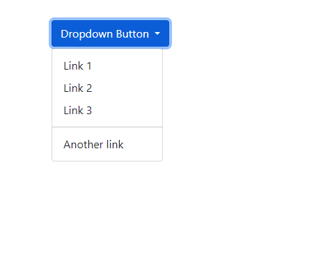
Time needed: 2 minutes
Create Bootstrap 5 dropdown step by step
- Step -1: Create a div with the .dropdown class
First, we create a div. In this div tag, we add a .dropdown class. Now the base of our dropdown is ready.
- Step -2: Add Button and the .dropdown-toggle class
We create the button. Then add the dropdown-toggle class and data-bs-toggle=’dropdown’ attribute to the button tag. We want to show a caret icon on this button. Here you can see that a default caret icon appears.
This is because of the Bootstrap 5 plugin.
If you have a lower bootstrap version, Then add a Span tag and add a caret class to it for showing caret. - Step -3: Add dropdown-menu and dropdown-item classes
Here we show a Dropdown menu list. So we create a normal unordered list in this dropdown div after the button. Then Add the .dropdown-menu class to the <ul> tag. Then every list item we add the .dropdown-item class to <li> tags.
So we create our first and basic Dropdown with Bootstrap 5. But we can customize it as we want.
How to change the direction of the dropdown menu
Sometimes we need to change the direction of the dropdown menu. So Bootstrap 5 provides us with those features with remote codes.
Change dropdown button color:
As we change the button, here we need to do the same. We simply add these classes to the <button> tag.
Codes for changing button color:
.btn-primary
.btn-secondary
.btn-success
.btn-danger
.btn-warning
.btn-info
.btn-light
.btn-dark<div class="dropdown">
<button type="button" class="btn btn-primary dropdown-toggle" data-bs-toggle="dropdown" aria-expanded="false">
Dropdown Primary
</button>
<ul class="dropdown-menu">
<li><a class="dropdown-item" href="#">Link 1</a></li>
<li><a class="dropdown-item" href="#">Link 2</a></li>
<li><a class="dropdown-item" href="#">Link 3</a></li>
<li><hr class="dropdown-divider"></li>
<li><a class="dropdown-item" href="#">Another link</a></li>
</ul>
</div>
<div class="dropdown">
<button type="button" class="btn btn-secondary dropdown-toggle" data-bs-toggle="dropdown" aria-expanded="false">
Dropdown secondary
</button>
<ul class="dropdown-menu">
<li><a class="dropdown-item" href="#">Link 1</a></li>
<li><a class="dropdown-item" href="#">Link 2</a></li>
<li><a class="dropdown-item" href="#">Link 3</a></li>
<li><hr class="dropdown-divider"></li>
<li><a class="dropdown-item" href="#">Another link</a></li>
</ul>
</div>
<div class="dropdown">
<button type="button" class="btn btn-success dropdown-toggle" data-bs-toggle="dropdown" aria-expanded="false">
Dropdown success
</button>
<ul class="dropdown-menu">
<li><a class="dropdown-item" href="#">Link 1</a></li>
<li><a class="dropdown-item" href="#">Link 2</a></li>
<li><a class="dropdown-item" href="#">Link 3</a></li>
<li><hr class="dropdown-divider"></li>
<li><a class="dropdown-item" href="#">Another link</a></li>
</ul>
</div>
<div class="dropdown">
<button type="button" class="btn btn-danger dropdown-toggle" data-bs-toggle="dropdown" aria-expanded="false">
Dropdown danger
</button>
<ul class="dropdown-menu">
<li><a class="dropdown-item" href="#">Link 1</a></li>
<li><a class="dropdown-item" href="#">Link 2</a></li>
<li><a class="dropdown-item" href="#">Link 3</a></li>
<li><hr class="dropdown-divider"></li>
<li><a class="dropdown-item" href="#">Another link</a></li>
</ul>
</div>
<div class="dropdown">
<button type="button" class="btn btn-warning dropdown-toggle" data-bs-toggle="dropdown" aria-expanded="false">
Dropdown warning
</button>
<ul class="dropdown-menu">
<li><a class="dropdown-item" href="#">Link 1</a></li>
<li><a class="dropdown-item" href="#">Link 2</a></li>
<li><a class="dropdown-item" href="#">Link 3</a></li>
<li><hr class="dropdown-divider"></li>
<li><a class="dropdown-item" href="#">Another link</a></li>
</ul>
</div>
<div class="dropdown">
<button type="button" class="btn btn-info dropdown-toggle" data-bs-toggle="dropdown" aria-expanded="false">
Dropdown info
</button>
<ul class="dropdown-menu">
<li><a class="dropdown-item" href="#">Link 1</a></li>
<li><a class="dropdown-item" href="#">Link 2</a></li>
<li><a class="dropdown-item" href="#">Link 3</a></li>
<li><hr class="dropdown-divider"></li>
<li><a class="dropdown-item" href="#">Another link</a></li>
</ul>
</div><div class="dropdown">
<button type="button" class="btn btn-light dropdown-toggle" data-bs-toggle="dropdown" aria-expanded="false">
Dropdown light
</button>
<ul class="dropdown-menu">
<li><a class="dropdown-item" href="#">Link 1</a></li>
<li><a class="dropdown-item" href="#">Link 2</a></li>
<li><a class="dropdown-item" href="#">Link 3</a></li>
<li><hr class="dropdown-divider"></li>
<li><a class="dropdown-item" href="#">Another link</a></li>
</ul>
</div>
<div class="dropdown">
<button type="button" class="btn btn-dark dropdown-toggle" data-bs-toggle="dropdown" aria-expanded="false">
Dropdown dark
</button>
<ul class="dropdown-menu">
<li><a class="dropdown-item" href="#">Link 1</a></li>
<li><a class="dropdown-item" href="#">Link 2</a></li>
<li><a class="dropdown-item" href="#">Link 3</a></li>
<li><hr class="dropdown-divider"></li>
<li><a class="dropdown-item" href="#">Another link</a></li>
</ul>
</div>
</div>Change the size of the dropdown button:
We have some classes to change the button size.
These classes, .btn-sm, .btn-md, and .btn-lg, are used to create different-sized buttons.
Change the direction of the dropdown with Bootstrap 5
With bootstrap classes, we can easily change the direction of the dropdown menu’s appearance.
.dropstart is used for triggering dropdown menus at the left of the button.
 <div class="dropstart">
    <button type="button" class="btn btn-primary dropdown-toggle" data-bs-toggle="dropdown" aria-expanded="false">
      Dropdown Button
    </button>
    <ul class="dropdown-menu">
      <li><a class="dropdown-item" href="#">Link 1</a></li>
      <li><a class="dropdown-item" href="#">Link 2</a></li>
      <li><a class="dropdown-item" href="#">Link 3</a></li>
      <li><hr class="dropdown-divider"></li>
      <li><a class="dropdown-item" href="#">Another link</a></li>
    </ul>
  </div>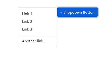
.dropend class triggers dropdown menus at the right of the button.
 <div class="dropend">
    <button type="button" class="btn btn-primary dropdown-toggle" data-bs-toggle="dropdown" aria-expanded="false">
      Dropdown Button
    </button>
    <ul class="dropdown-menu">
      <li><a class="dropdown-item" href="#">Link 1</a></li>
      <li><a class="dropdown-item" href="#">Link 2</a></li>
      <li><a class="dropdown-item" href="#">Link 3</a></li>
      <li><hr class="dropdown-divider"></li>
      <li><a class="dropdown-item" href="#">Another link</a></li>
    </ul>
  </div>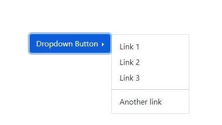
Answer: If you have Bootstrap lower version then add a span tag after the text. Then use class caret in this span tag.
If you have the Bootstrap 5 Dropdown, it automatically adds a caret.
Answer: In your Dropdown list, add .dropdown-divider class in the <li> tag.
Magnificent website. Lots of helpful info here. I am sending it to some pals ans additionally sharing in delicious. And certainly, thank you to your sweat!
Write more, thats all I have to say. Literally, it seems as though you relied on the video to make your point. You obviously know what youre talking about, why throw away your intelligence on just posting videos to your blog when you could be giving us something enlightening to read?
I really appreciate this post. I¦ve been looking everywhere for this! Thank goodness I found it on Bing. You’ve made my day! Thx again