In this blog, we will learn about Bootstrap alerts. Basically, alert classes add some styles to messages. Therefore those messages take more attention to the users or viewers.
Here we learn different types of alerts. We will create a closing alert. We also learn to add links to an alert. On the other hand, we can say we learn all the things about bootstrap alerts.
Table of Content:
- Create simple alerts
- Add a link to the alerts
- Add aditional contents
- Closing Alerts
- Create alerts with icons
Create simple Bootstrap alerts:
Firstly, we need to add the Bootstrap CSS link. Otherwise, no classes are useable. Just copy the link and place it into the header tag.
Here’s the link
<link rel="stylesheet" href="https://maxcdn.bootstrapcdn.com/bootstrap/4.0.0/css/bootstrap.min.css" integrity="sha384-Gn5384xqQ1aoWXA+058RXPxPg6fy4IWvTNh0E263XmFcJlSAwiGgFAW/dAiS6JXm" crossorigin="anonymous"> We learn to create a simple alert with bootstrap code. Basically, we can create alerts with .alert class.
Alert class simply gives extra padding and margin to the content. And the class also provides a basic color according to your class. So that viewers will pay extra attention to that content.
Demo:
Here’re codes:
<div class="alert alert-primary" role="alert">
   <strong>Primary!</strong> This is Primary Alert.
</div>

<div class="alert alert-primary" role="alert">
  <strong>Success!</strong>This is Success Alert.
</div>

<div class="alert alert-danger" role="alert">
  <strong>Danger!</strong> This is Danger Alert.
</div>
List of Bootstrap alerts classess
- alert-primary
- alert-secondary
- alert-success
- alert-danger
- alert-warning
- alert-info
- alert-light
- alert-black
Add a link to the Bootstrap alerts:
On our websites, we sometimes need to provide a link to the alert. So we need a class to add a link. Here we have a class .alert-link. With this class, we can add a link to the href tag.
Demo:
If you click the bold-lettered Link, you will go to our official website.
Here’s Code:
<div class="alert alert-primary" role="alert">
  <a href="#" class="alert-link">Link!</a>. is here.
</div>
<div class="alert alert-success" role="alert">
  This is a success alert with <a href="#" class="alert-link">Link!</a>. is here.
</div>
<div class="alert alert-success" role="alert">
  This is a success alert with <a href="#" class="alert-link">Link!</a>. is here.
</div>
Here you must place the link or URL into the href tag. Otherwise, it doesn’t work. We create a primary-colored alert with a link. But you can also create alerts with various colors.
Note:
- You should use the
<a>tag. - You must use href attribute. This indicates the link’s destination.
- You can use target=”_blank” attribute into
<a>tag. So that the linked page will display in a new window.
Add Aditional Content:
Sometimes we need to add some additional content to the alerts. Basically, there is no specified class. But when we want to add some additional contents we just use a <hr> tag. Therefore a horizontal line will appear.
Now add your additional content to the bootstrap alert. Create a <p> tag and add the contents.
Here’s Codes
<div class="alert alert-success" role="alert">
    <p>Aww yeah, you successfully read this important alert message. This example text is going to run a bit longer so
      that you can see how spacing within an alert works with this kind of content.</p>
    <hr>
    <p class="mb-0">Whenever you need to, be sure to use margin utilities to keep things nice and tidy.</p>
  </div>
Bootstrap Closing Alerts:
This alert is very useful. Sometimes we show an alert on our website. But when viewers see this alert message, they can close or hide it with a close button. We can easily create this alert with the Bootstrap class. But we need some specific classes.
So we just use a button class. Then we add the close event to the button. But here we need javascript plugging. Don’t worry we just add the below <script> on our pages.
Here’re script:
<script src="https://code.jquery.com/jquery-3.2.1.slim.min.js" integrity="sha384-KJ3o2DKtIkvYIK3UENzmM7KCkRr/rE9/Qpg6aAZGJwFDMVNA/GpGFF93hXpG5KkN" crossorigin="anonymous"></script>

<scriptsrc="https://cdnjs.cloudflare.com/ajax/libs/popper.js/1.12.9/umd/popper.min.js" integrity="sha384-ApNbgh9B+Y1QKtv3Rn7W3mgPxhU9K/ScQsAP7hUibX39j7fakFPskvXusvfa0b4Q" crossorigin="anonymous"></script>

<script src="https://maxcdn.bootstrapcdn.com/bootstrap/4.0.0/js/bootstrap.min.js" integrity="sha384-JZR6Spejh4U02d8jOt6vLEHfe/JQGiRRSQQxSfFWpi1MquVdAyjUar5+76PVCmYl" crossorigin="anonymous"></script>
This script you can copy from here or copy from the bootstrap Official Website. After copying the script files, just place them inside or outside of the body tag. Therefore your Closing alert or Dismiseble alerts gets the javascript functionalities.
Demo:
If you click the cross button, the alert will hide. So viewers can remove the alert message if they once read it. But you refresh the page then the alert will be visible again.
<div class="alert alert-primary alert-dismissible fade show" role="alert">
<strong>Success!</strong> This is an alert.
<button type="button" class="close" data-dismiss="alert" aria-label="Close">
<span aria-hidden="true">×</span>
</button>
</div>
<div class="alert alert-success alert-dismissible fade show" role="alert">
<strong>Success!</strong> This is an alert.
<button type="button" class="close" data-dismiss="alert" aria-label="Close">
<span aria-hidden="true">×</span>
</button>
</div>
<div class="alert alert-danger alert-dismissible fade show" role="alert">
<strong>Success!</strong> This is an alert.
<button type="button" class="close" data-dismiss="alert" aria-label="Close">
<span aria-hidden="true">×</span>
</button>
</div>
Notes:
- You should load Bootstrap Javascript pluging.
- You must add a close button and add
.alert-dismissbleclass . So that the right of the alerts components get some padding. - Use data-dismissble=”alert” attribute. So that the javascript functionalities properly works.
- We also add fade show classes . That’s why alert gets an animation when it’s closing.
Create alerts with icons:
There is an easy way to create or add icons to the alerts. We just add a bootstrap icon cdn to the <header> tag. Then go to the bootstrap official website or just click here to get the bootstrap icon codes.
We just copy the codes of our icon and place it where we want. So you can also use icons on the alert sections.
Bootstrap icon is here:
<link rel="stylesheet" href="https://cdnjs.cloudflare.com/ajax/libs/bootstrap-icons/1.5.0/font/bootstrap-icons.min.css">
Simply copy these and place them into the <header> tag.
Here’re codes
<div class="alert alert-primary" role="alert">
  <i class="bi bi-backspace-reverse-fill"></i>This is a primary alert with <a href="#" class="alert-link">an example link</a>. Give it a click if you like.
</div>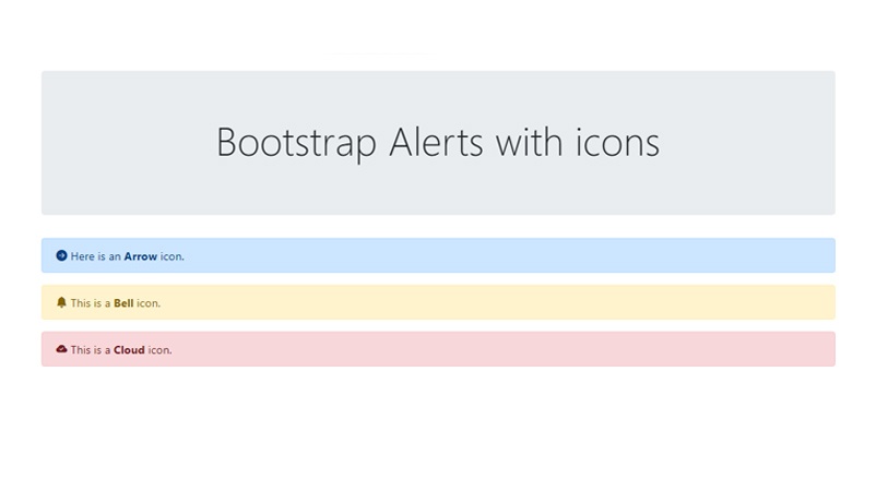


Hey There. I fohnd your blog the uuse oof msn. That iis
an extremely neatly wrritten article. I’ll make sure tto bookmark it and comke ack to lezrn exfra oof your usdeful information.
Thank yoou for the post. I will certainly return.
Thanks for your blog, nice to read. Do not stop.
Hi every one, here every person is sharing such experience, therefore it’s nice to read this weblog, and I
used to pay a visit this blog every day.
I am often to blogging and i really appreciate your content. The article has really peaks my interest. I am going to bookmark your site and keep checking for new information.
I genuinely enjoy looking through on this internet site, it contains good blog posts. “Sometime they’ll give a war and nobody will come.” by Carl Sandburg.
Great content! Keep up the good work!
I went over this web site and I think you have a lot of excellent information, saved to my bookmarks (:.