Bottom Navigation Bar or NavBar is a common thing and the most important thing in any Mobile App. It is a Material Widget. It is used for navigating different pages of the Application. In this tutorial, we learn to create a Bottom Navigation in Flutter. After that, we also make different types of Animated Bottom Navigation bars.
Table of Content
- Introduction: What is the Bottom Navigation Bar
- Create a Simple Bottom Navbar
- Step-1: Create a Scaffold Widget
- Step-2: Add Bottom Navigation Bar Widget
- Step-3: Populate the Bottom Navigation Bar with Items
- Properties of Bottom Nav Bar
- Route to another Page with the Bottom Navigation bar
- Step-1: Add Dependency to the PubSpec.yaml file
- Step-2: Import the packages
- Step-3: Codes for Curved Navigation Bar
- Animated Bottom Nav Bar: Curved Navigation Bar
 More Animated Bottom Navigation Bar Examples with Codes
Introduction: What is the Bottom NavBar
According to Flutter, A material widget that’s displayed at the bottom of an app for selecting among a small number of views, typically between three and five.
This Bottom Navigation Bar obtains multiple items like icons and labels. We can set it inside the Scaffold widget. First, we need to know some introductory notes about this widget.
Notes:
- Our Bottom NavBar should have at least two elements.
- We can use icons and text widgets.
- We can use routes for navigating the page.
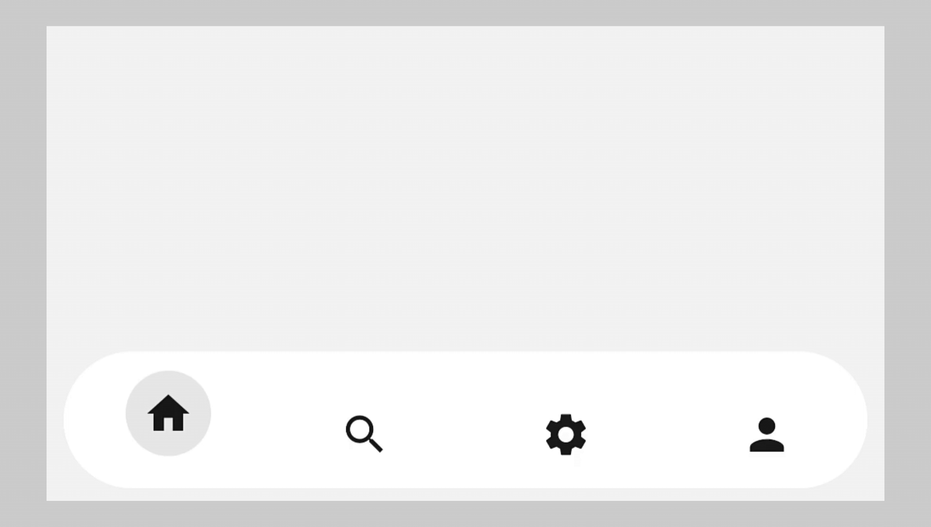
Create Simple Bottom Navigation Bar
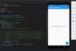
At first, we learn how to create a basic Bottom Navigation Bar, its components, and its properties. Then we will learn to navigate different pages with it. And Also create an animated Bottom Nav Bar. Here we create a simple page with an App Bar and add the title ‘Demo’.
Step-1: Create a Scaffold Widget
We create a Stateful Widget. And inside the stateful widget, we create a Scaffold widget. This Scaffold has the property of the Bottom Navigation Bar.
Step-2: Add Bottom Navigation Bar Widget
Then we create the Bottom Navigation Bar widget. Now inside this widget, we need items. Here we need a list of items. These items are BottomNavigationBar items.
Step-3: Populate the Bottom Navigation Bar with Items
This is also a widget. Now BottomNavigationBar item has two arguments. Icon and Label. These arguments should not be null.
Here we create three items. Every item has an icon and label. Icon arguments have Icon widgets. And Label arguments have Text widgets.
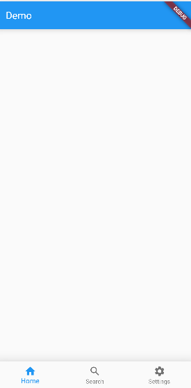
Now our Bottom Nav bar is created. But the design is too simple and not so much eye-catching. So we will learn to customize it.
bottomNavigationBar: BottomNavigationBar(
  items: <BottomNavigationBarItem>[
        BottomNavigationBarItem(icon: Icon(Icons.home), label: "Home"),
        BottomNavigationBarItem(icon: Icon(Icons.search), label: "Search"),
        BottomNavigationBarItem(icon: Icon(Icons.settings), label: "Settings"),
      ]),
We add home icons, search icons, and settings icons. This Nav bar has white background color and elevation. These are some properties of the Bottom Nav Bar. But our bottom nav bar does not change the current index. We can’t select the next item. Because we don’t write any program for it. Before we learn that we learn some basic properties of the Bottom Nav Bar.
Before we start customizing our bottom nav bar. We need to know its properties. If you read the documentation you will see there are more than 10 properties of it. But we discuss the most important of them.
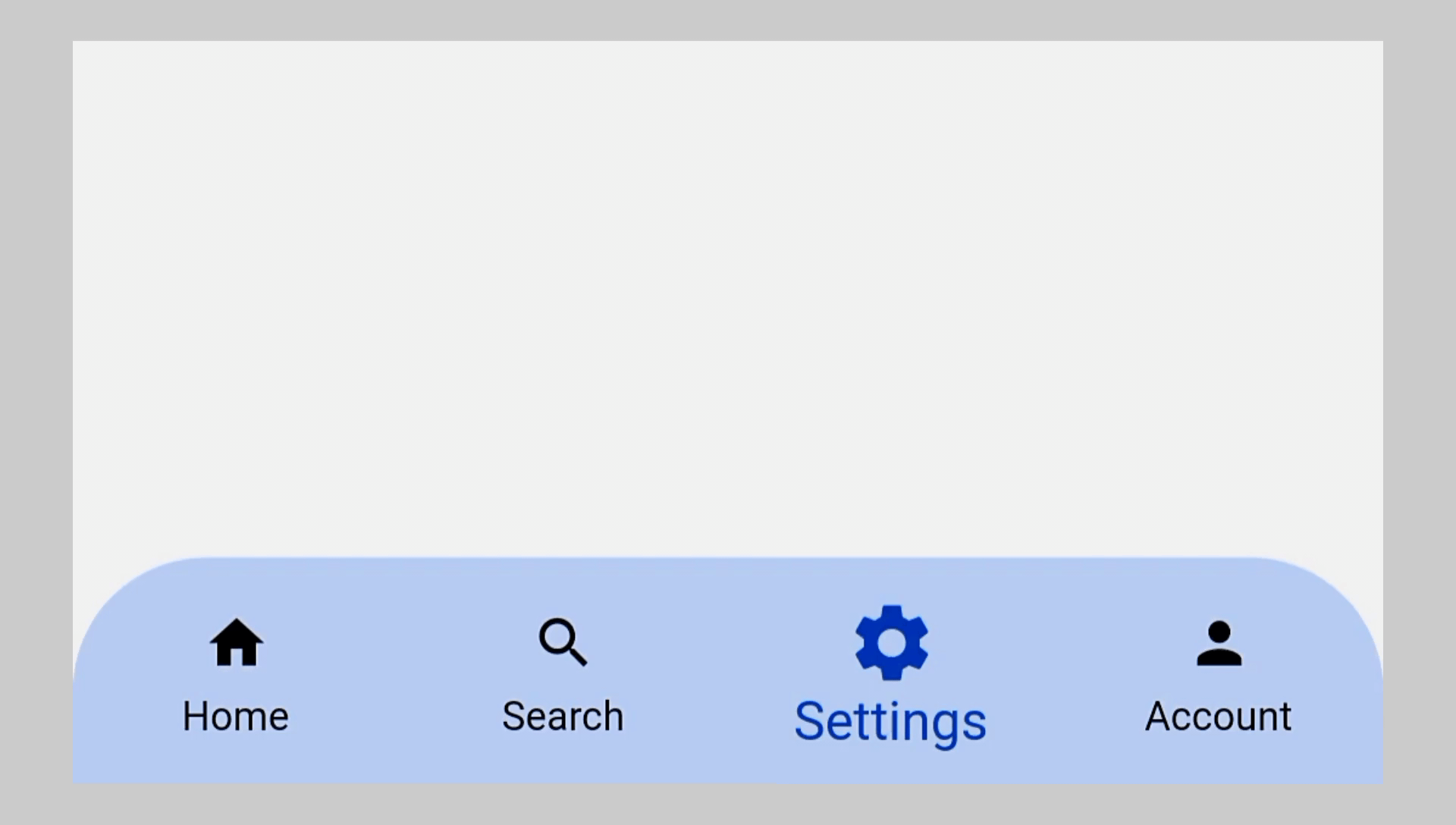
Properties of Bottom Nav Bar
backgroundColor: We can change the background color with this property.
iconSize: We can change the icon size with this.
selecteditemcolor: Define a specific color of the selected item.
unselectedItemColor: Define a specific color of the unselected items.
currentIndex: With this property, we can select a BottomNavigationBar item when you open the Application.
selectedFontSize: Add specific font size of selected item.
unselectedFontSize: add specific font size of unselected items.
onTap: Basically, when we want to add some event we need this property.
There are more properties you can check out in the documentation.
 bottomNavigationBar: BottomNavigationBar(
          backgroundColor: Colors.orange,
          iconSize: 26,
          selectedItemColor: Colors.black,
          unselectedItemColor: Colors.white,
          currentIndex: 1,
          selectedFontSize: 20,
          unselectedFontSize: 14,
          items: <BottomNavigationBarItem>[
            BottomNavigationBarItem(
                icon: Icon(Icons.home), label: "Home", tooltip: "Home"),
            BottomNavigationBarItem(
                icon: Icon(Icons.search), label: "Search", tooltip: "Search"),
            BottomNavigationBarItem(
                icon: Icon(Icons.settings),
                label: "Settings",
                tooltip: "Settings"),
          ]),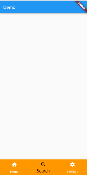
Here we use those properties to customize our Buttom NavBar. We add a deep purple background color. Its selected icon color is white and the selected font size is 20. But the current index is 1. So that it by default selects the 2nd item of the BottomNavigationBar items.
Finally, we learn to create and customize the Bottom Nav Bar in Flutter. Now it’s your turn to create your own designed Bottom Nav Bar.
Route to another Page with the Bottom Navigation bar
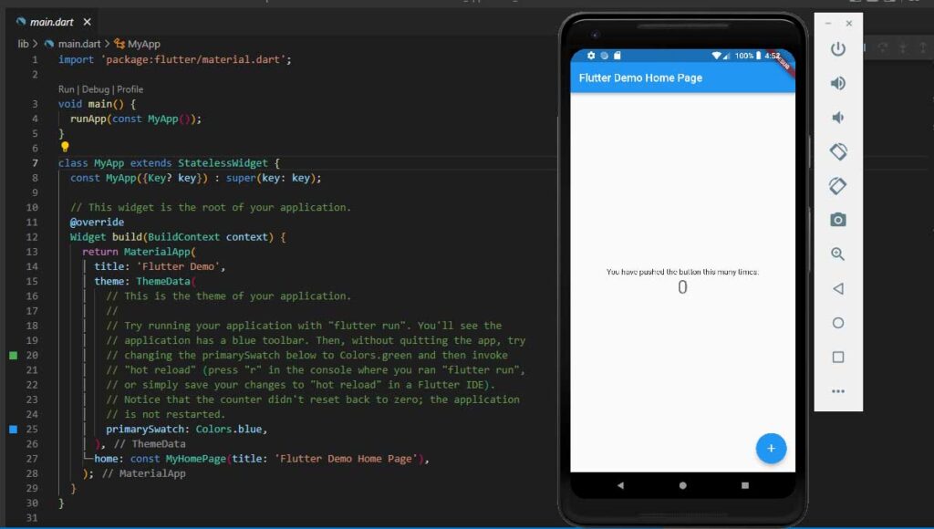
Now we learn to route another page with the bottom nav bar. First of all, we create three pages, Home, Search, and Setting. We just add a text Center of every page showing its name. In this tutorial, we can understand whether our bottom nav bar is working or not.
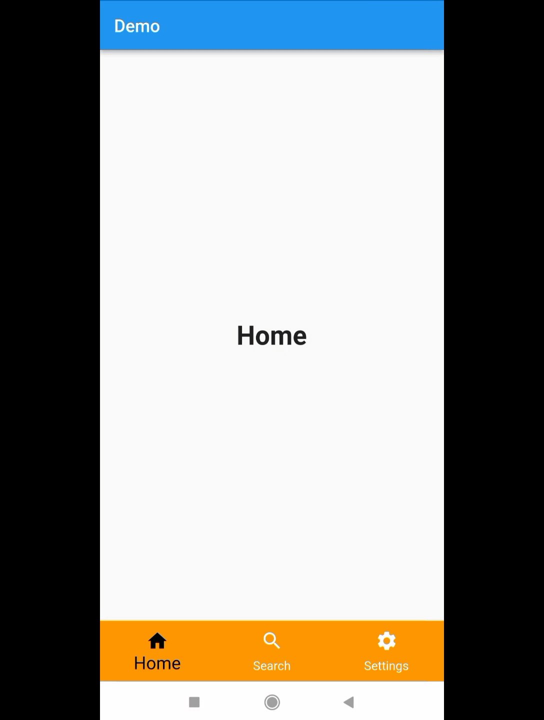
- At first, we create a variable named current_index which is int type. And we assign its value 0. So that it selects the first item of the Bottom nav bar. In the Bottom Nav Bar, the currentIndex holds this current_index variables’ value.
- Then we create a List that is Widget type. The name of the List is pages. Then we add those pages orderly in the List. So that when we select an item from the bottom nav bar, it changes its currentIndex according to the order of the pages’ index in the List.
- Now we create a method named OnTapped. It is a void-type method. Then we add the set state method. Our current_index variable holds the value or selected item. In the Bottom Nav Bar, the onTap property has this OnTapped method.
void main() {
  runApp(MyApp());
}

class MyApp extends StatelessWidget {
  const MyApp({Key? key}) : super(key: key);

  @override
  Widget build(BuildContext context) {
    return MaterialApp(
      home: HomePage(),
    );
  }
}

class HomePage extends StatefulWidget {
  const HomePage({Key? key}) : super(key: key);

  @override
  State<HomePage> createState() => _HomePageState();
}

class _HomePageState extends State<HomePage> {
  int current_index = 0;
  final List<Widget> pages = [Home(), SearchPage(), SettingsPage()];

  void OnTapped(int index) {
    setState(() {
      current_index = index;
    });
  }

  @override
  Widget build(BuildContext context) {
    return Scaffold(
      appBar: AppBar(
        title: Text("Demo"),
      ),
      body: pages[current_index],
      bottomNavigationBar: BottomNavigationBar(
          backgroundColor: Colors.orange,
          iconSize: 26,
          selectedItemColor: Colors.black,
          unselectedItemColor: Colors.white,
          currentIndex: current_index,
          selectedFontSize: 20,
          unselectedFontSize: 14,
          onTap: OnTapped,
          items: <BottomNavigationBarItem>[
            BottomNavigationBarItem(
                icon: Icon(Icons.home), label: "Home", tooltip: "Home"),
            BottomNavigationBarItem(
                icon: Icon(Icons.search), label: "Search", tooltip: "Search"),
            BottomNavigationBarItem(
                icon: Icon(Icons.settings),
                label: "Settings",
                tooltip: "Settings"),
          ]),
    );
  }
}
Now when we tap an item on the bottom Nav Bar, the Set State Method Show the item.
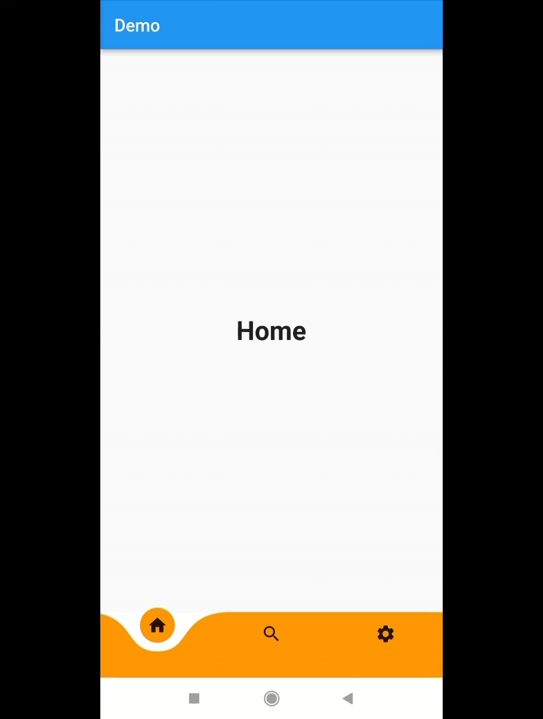
Animated Bottom Navigation Bar: Curved Navigation Bar
We can create different types of animated Bottom Navigation Bars. But in this tutorial, we will learn to create a Curved Navigation Bar. It is nothing but Animating Curved Shape NavBar. And we can change the color, icon size, animation duration, etc. And customize the Curved Navigation Bar as our requirement.
Score:
The curved Navigation Bar is one of the most popular and demanding packages. It has 1451 likes, and 99% popularity.
PUB POINTS: Flutter awarded it 130 pub points.
Step-1: Add Dependency in PubSpec file:
Now we will create a lively bottom nav bar. So we need to add a dependency called curved_navigation_bar. It supports sound null safety. We add this dependency in pubspec.yaml file. Here you must align the curved_navigation_bar dependency correctly as we show below. After adding this package run the Flutter pub get command.
dependencies:
  flutter:
    sdk: flutter
  curved_navigation_bar: ^1.0.3
Step-2: Import the packages
Here you can see it has a Curved Navigation Bar Widget. Then we must import its file at the top. If we work in Vs code, it automatically imports the file.
import 'package:curved_navigation_bar/curved_navigation_bar.dart';Step-3: Codes for Curved Navigation Bar
Then we need some changes. It doesn’t have any labels. We just add the background color white. And the color of the bottom nav bar is orange. We can also change the animation duration.
bottomNavigationBar: CurvedNavigationBar(
          backgroundColor: Colors.white,
          color: Colors.orange,
          onTap: OnTapped,
          items: <Widget>[
            Icon(Icons.home),
            Icon(Icons.search),
            Icon(Icons.settings),
          ]),
Now we can follow the same process we mentioned above to change the pages with the Bottom nav bar.
More Animated Bottom Navigation Bar :
Here we provided two Animated Bottom Navigation Bar examples. Just click on the image and get the Code.
Example-1
Example-2
Note:
- Add the code to change the index of the Bottom Nav Items.
- Example 1 is a curved Bottom Nav bar. So you need to add dependency mentioned above.
Do you face some problems installing Flutter in Vs Code? Then check out our post below.


Good day! This post couldn’t be written any better! Reading through this post reminds me of my previous room mate! He always kept talking about this. I will forward this write-up to him. Fairly certain he will have a good read. Many thanks for sharing!
Hello There. I found your blog using msn. This is an extremely well written article. I’ll make sure to bookmark it and come back to read more of your useful info. Thanks for the post. I’ll definitely comeback.
I wanted to thank you for this fantastic read!! I certainly enjoyed every little bit of it. I have got you saved as a favorite to check out new stuff you postÖ