The navigation bar is the most important thing on the website. But there are a lot of visitors who come to your website who are using mobiles or tabs. So your website should be responsive as well as your navigation bar or navbar also. But only through CSS and Javascript, it may be hard and consume lots of time. For these reasons bootstrap’s getting so popular among web designers. Here we discuss how to create a responsive navbar with Bootstrap. Thus we’re using bootstrap on our website, so we don’t need to write so many codes for making it responsive.
Why do we create a responsive navbar with Bootstarp on our website?
Responsiveness is the basic feature of a website. Because nowadays most of the family have a smart form and use the internet. So it is natural that they may visit your website. If your website is fully responsive but the navbar is not responsive.
Then the appearance of your web is not impressive. Then it should be possible that the visitor doesn’t come again to your website. So we should make our website responsive. And if we use Bootstrap, we don’t need to write basic CSS and Javascript Codes.
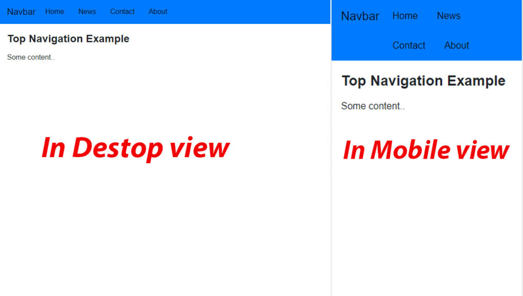
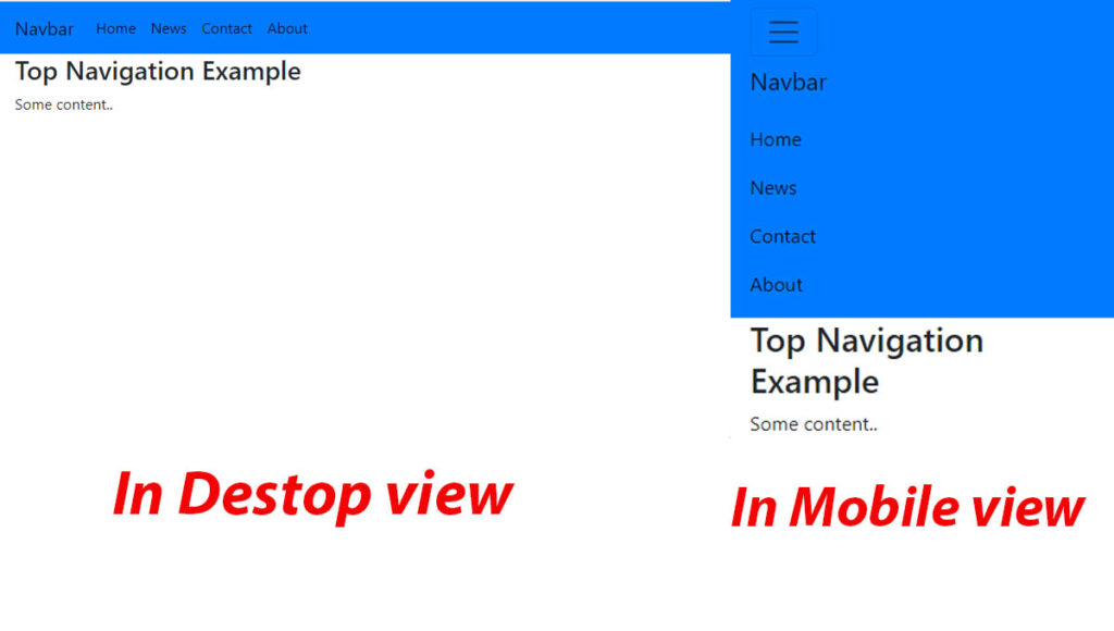
Table of content
Setup the Basic Environment
Before we’re starting to create a navbar with bootstrap, we need to set up our environment. At first, we need to add both CSS files and Javascript files of Bootstrap. Copy the Stylesheet <link> to the <header> tag. Then add the Jquery library into the <script> tag.
CSS files :
<link rel="stylesheet" href="https://maxcdn.bootstrapcdn.com/bootstrap/4.0.0/css/bootstrap.min.css" integrity="sha384-Gn5384xqQ1aoWXA+058RXPxPg6fy4IWvTNh0E263XmFcJlSAwiGgFAW/dAiS6JXm" crossorigin="anonymous">jQuery Library :
<script src="https://code.jquery.com/jquery-3.2.1.slim.min.js" integrity="sha384-KJ3o2DKtIkvYIK3UENzmM7KCkRr/rE9/Qpg6aAZGJwFDMVNA/GpGFF93hXpG5KkN" crossorigin="anonymous"></script>
<script src="https://cdnjs.cloudflare.com/ajax/libs/popper.js/1.12.9/umd/popper.min.js" integrity="sha384-ApNbgh9B+Y1QKtv3Rn7W3mgPxhU9K/ScQsAP7hUibX39j7fakFPskvXusvfa0b4Q" crossorigin="anonymous"></script>
<script src="https://maxcdn.bootstrapcdn.com/bootstrap/4.0.0/js/bootstrap.min.js" integrity="sha384-JZR6Spejh4U02d8jOt6vLEHfe/JQGiRRSQQxSfFWpi1MquVdAyjUar5+76PVCmYl" crossorigin="anonymous"></script>
Now our setup is ready. After adding this link to the header tag, now your website is able to use the bootstrap styles. And script tag helps us to use Javascript files and the jQuery library of Bootstrap.
Create a Responsive Bootstrap Navbar
Step-1: Basic navbar
Now we’ll create our responsive navbar with bootstrap. Here we use <nav> tag with .navbar class.
<nav class="navbar navbar-expand-lg navbar-dark bg-dark">
    <a class="navbar-brand" href="#">Navbar</a>
    <div class="collapse navbar-collapse" id="navbarNav">
      <ul class="navbar-nav">
        <li class="nav-item active">
          <a class="nav-link" href="#">Home <span class="sr-only">(current)</span></a>
        </li>
        <li class="nav-item">
          <a class="nav-link" href="#">Features</a>
        </li>
        <li class="nav-item">
          <a class="nav-link" href="#">Pricing</a>
        </li>
      </ul>
    </div>
  </nav>
Inside the <nav> tag we add <ul> and <li> for making our menus. Then We used .navbar-nav class into the <ul> tag. And we also used .nav-item into <li> tags. Here we used .active class for making the home page active. Youn can notice that our navbar also has a hover effect. We also use some classes like navbar-expand-lg and collapse. But we will discuss it in the next step.
Step-2: Make the navbar responsive
But our navbar is not responsive at all. Now we will make it responsive. Before we start we surely notice that our navbar has a <div> with collapse class. Because of this, our nav-items will hide when the screen will be collapsed.
<div class="collapse navbar-collapse" id="navbarNav">Now we want to display a menu button when the screen collapse. So we add a button with the .navbar-toggler class. To show the icon we use the .navbar-toggler-icon class into the <span> tag.
 <button class="navbar-toggler" type="button" data-toggle="collapse" data-target="#navbarNavAltMarkup" aria-controls="navbarNavAltMarkup" aria-expanded="false" aria-label="Toggle navigation">
    <span class="navbar-toggler-icon"></span>
  </button>
Here we create our first responsive navbar with Bootstrap. We can change the color and also add a Logo or Image to it.
Contents of Bootstarp Navbar
We can add or display some basic but important things in the navbar. So sometimes we need to add a dropdown option or we want to create a search box in the navbar. Bootstrap provides us with some classes. Through these classes, we can easily add these things to the navbar with a number of codes.
1. How to Add a Image to the Navbar
We use the navbar-brand class to show the brand name. Sometimes we want to display a logo or an image of our company. Now to show an image we just use a basic HTML <img> tag and write the source in the src attribute. Then we set the width and height of the image.
<nav class="navbar navbar-light bg-light">
  <a class="navbar-brand" href="#">
    <img src="" width="50" height="50" alt="">
  </a>
</nav>
2. How to Add a Search Bar to the Bootstarp Navbar
A search bar is the most important and common thing. Some of the websites don’t need a search bar. But some websites definitely need a search bar. So we now add a search bar to the bootstrap navbar with the form-inline class.
<form class="form-inline">
    <input class="form-control mr-sm-2" type="search" placeholder="Search" aria-label="Search">
    <button class="btn btn-success" type="submit">Search</button>
  </form>
Here we add a search bar and also a submit button. But here if you don’t want this button or just want to change the button’s style then you can visit our blog Bootstrap buttons.
3. How to create a dropdown in the Bootstrap Navbar
Next, we want to create dropdown options in the navbar with the dropdown class. With the help of Bootstrap, we can easily add a dropdown in the navbar.
<li class="nav-item dropdown">
          <a class="nav-link dropdown-toggle" href="#" id="DropdownMenu" data-toggle="dropdown" aria-haspopup="true"
            aria-expanded="false">
            Dropdown menu
          </a>
          <div class="dropdown-menu" aria-labelledby="DropdownMenu">
            <a class="dropdown-item" href="#">Action</a>
            <a class="dropdown-item" href="#">Another action</a>
            <a class="dropdown-item" href="#">Something else here</a>
          </div>
        </li>
We use dropdown class in the <li> tag with nav-item class. Then we create options with the dropdown-item class.
Placement of the Navbar
How to create a sticky top responsive Navbar
We can easily create a sticky top navbar with Bootstrap. Bootstrap has the sticky-top class for this. Just use it in the <nav> tag.
<nav class="navbar sticky-top navbar-dark bg-dark">
...
...
</nav>
Color Schemes
1.How to Change the Background Color of the Navbar
There are some specific colors Bootstrap provides you with class. These are bg-primary, bg-secondary, bg-warning, bg-success, bg-danger, bg-light, bg-dark. But we also can use other colors with their color code.
Hope you understand how to create a responsive navbar with Bootstrap. If we made any mistake please comment us.


Hello, Neat post. There’s an issue together with your web site in web explorer, may check this?K IE nonetheless is the marketplace leader and a huge part of folks will miss your fantastic writing due to this problem.
Hello.This article was extremely interesting, particularly since I was searching for thoughts on this issue last Wednesday.