The grid system is one of the most important style structures. We use it for making content more stylish and responsive. Here we learn about it from the basic.
So what we are going to learn
- What is Grid?
- Grid Classes for different Screen Size.
- Examples
So What is Grid?
According to Wikipedia,
“In graphic design, a grid is a structure (usually two-dimensional) made up of a series of intersecting straight (vertical, horizontal, and angular) or curved lines (grid lines) used to structure content. The grid serves as an armature or framework on which a designer can organize graphic elements (images, glyphs, paragraphs, etc.) in a rational, easy-to-absorb manner.”
On our web page, we want to make the content eye-catching. Therefore, we add some style to the page. Grid system allows us to make a layout through a series of rows and columns.
Basically, the Bootstrap Grid system allows up to 12 columns across the page. So You can use these columns individually or you can group the columns together. Therefore, you can create a wider column.
Row :
we use .row class to create a new row .
Column:
We use .col class for making a new column in a row. Though, there are various types of classes for making responsive columns for different systems. Later We learn all of those classes in this blog. Firstly, we learn to create some rows and columns with some basic classes.
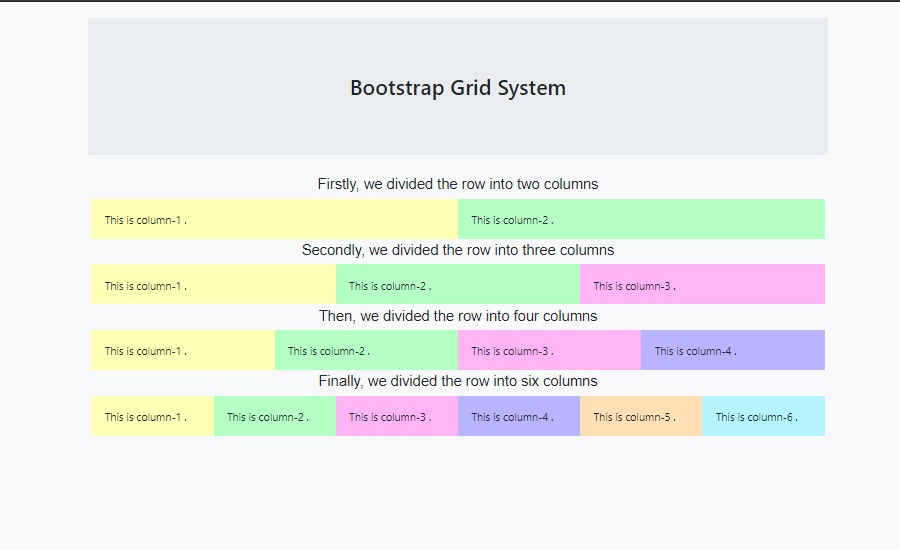
Now, look into the above box. We made a row. Then we divided it into some equivalent columns. We use bootstrap’s classes to make these multiple rows and columns. Not only these, but we can also make various columns with different sizes.
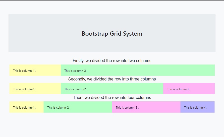
You can see that we can make different sizes of columns. All of those columns are made with different classes .
Useful classes for making Rows and Columns:
Grid System for different screen size
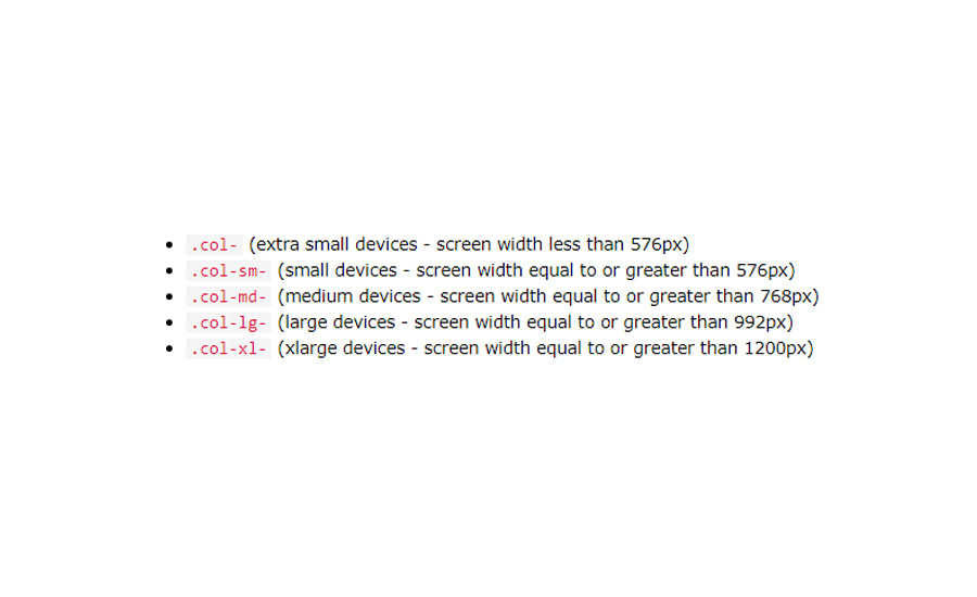
In the above picture, you can see the class which we used for making responsive columns. Sm means small devices like mobile phones. md means medium devices like tabs. And lg / xl refers to big screen devices like laptops and computers.
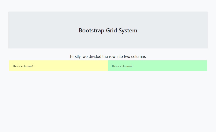
First ,we make two mobile responsive columns in a row. So we need these classes .col-lg-6 and .col-sm-6 .
<!DOCTYPE html>
<html>
<head>
<title>Blogs</title>
<link rel="stylesheet" href="https://maxcdn.bootstrapcdn.com/bootstrap/4.0.0/css/bootstrap.min.css" integrity="sha384-Gn5384xqQ1aoWXA+058RXPxPg6fy4IWvTNh0E263XmFcJlSAwiGgFAW/dAiS6JXm" crossorigin="anonymous">
</head>
<style>
h2{
text-align: center;
margin: 20px;
}
#col{
height:60px;
padding:20px;
}
.row{
margin:5px;
}
h6 {
text-align: center;
font-size: 22px;
font-family: arial;
}
</style>
<body class=" bg-light p-4 mt-5">
<div class="container ">
<div class="jumbotron ">
<h2>Bootstrap Grid System</h2>
</div>
</div>
<div class="container ">
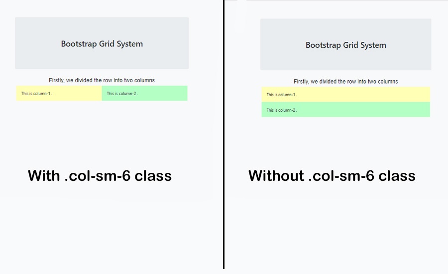
<h6>Firstly, we divided the row into two columns</h6>
<div class="row">
<div class="col-lg-6 col-sm-6" style="background-color:#ffffb4;" id="col">
<p>This is column-1 .</p>
</div>
<div class="col-lg-6 col-sm-6" style="background-color:#b4ffc4;" id="col">
<p>This is column-2 .</p>
</div>
</div>
</body>
</html>Make it responsive
We use .col-sm.6 class for making these columns mobile responsive. ‘sm ‘ refers to small devices. If we don’t use that class, then it looks like two rows in mobiles or small devices. But if we want to make a single column in a row then we use the class .col-sm-12 .
Similarly, we can create 3 columns in a row. We just write the class .col-4 . So we can also create 4 columns in a row with the class .col-3 .We just add lg / sm /md for different types of devices. Further, we will learn more things about it. Hope you understand the grid system of Bootstrap.
In our next blog, we learn how to make different types of buttons with bootstrap classes. If we miss our previous blog then visit this page jumbotron.

I actually wanted to make a simple note to be able to say thanks to you for all the nice pointers you are sharing at this site. My incredibly long internet look up has at the end of the day been recognized with incredibly good knowledge to go over with my relatives. I would suppose that we site visitors actually are undeniably blessed to live in a very good network with many perfect people with beneficial guidelines. I feel very much fortunate to have come across your entire webpages and look forward to some more excellent moments reading here. Thanks once again for a lot of things.
It is actually a great and helpful piece of information. I am glad that you just shared this helpful information with us. Please stay us up to date like this. Thanks for sharing.
Its great as your other blog posts : D, regards for posting.
I am lucky that I found this weblog, exactly the right information that I was searching for! .
Some really wonderful work on behalf of the owner of this site, perfectly outstanding content.
Good day! I know this is kinda off topic but I was wondering which blog platform are you using for this website? I’m getting sick and tired of WordPress because I’ve had issues with hackers and I’m looking at alternatives for another platform. I would be fantastic if you could point me in the direction of a good platform.
I conceive you have observed some very interesting details, thankyou for the post.
Magnificent site. Plenty of helpful info here. I?¦m sending it to some friends ans also sharing in delicious. And naturally, thanks in your effort!