Bootstrap provides us with a lot of numbers of utilities. With these classes of utilities, we can create our websites easily. But sometimes our websites are unable to catch the viewer’s attention. Sometimes we just need to add margin and padding to the website.
With this minor step, the appearance of our websites becomes more attractive and gains more attention from viewers. But sometimes it may be difficult because many users use phones, tabs, mini laptops. So our website should be responsive. But here bootstrap has spacing utility classes that are responsive-friendly with various-sized screens.
Margin:
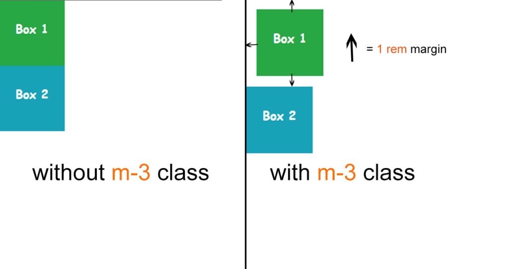
Margin provides space around an element, outside of any defined border. So that we can add margin to an element to its every side like a top, bottom left, and right. We use margin to add a space between two elements. There are four margin properties:
- margin-top
- margin-bottom
- margin-left
- margin-right
Padding:
Padding provides space around an element, inside of any defined border. It also has four properties like
- padding-top
- padding-bottom
- padding-left
- padding-right
Notation for Margin and Padding
There are some simple notations that we can use. These notations or class names have a format. This format is {property}{sides}-{size}. It is the basic format for small devices like smartphones. But we can also add the breakpoint for different screen-sized devices.
We can also add a breakpoint. So that format is {property}{sides}-{breakpoint}-{size}.
Properties:
There are two properties. One is for margin and another one is for padding.
| m | for classes that set margin |
| p | for classes that set padding |
Sides:
As we know there are mainly four sides where we use spacing utilities. Those are
| Bootstrap Code | Directions |
| t | for classes that set margin-top or padding-top |
| b | for classes that set margin-bottom or padding-bottom |
| l | for classes that set margin-left or padding-left |
| r | for classes that set margin-right or padding-right |
Both sides :
We also add spacing to both sides with these notations.
| x | for classes that set both *-left and *-right |
| y | for classes that set both *-top and *-bottom |
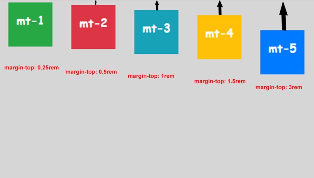
Values:
We have some numerical values to add specific margins and padding. So We just those numerical values and bootstrap auto
| Values | CSS Values |
| 0 | 0 rem |
| 1 | 0.25 rem |
| 2 | 0.5 rem |
| 3 | 1 rem |
| 4 | 1.5 rem |
| 5 | 3 rem |
Break-points:
Here bootstrap has 4 breakpoints for different kinds of screens.
| Breakpoints | Dimensions |
| xm | <576px |
| sm | ≥576px |
| md | ≥768px |
| lg | ≥992px |
| xl | ≥1200px |
If you want to learn how to create a responsive navbar with bootstrap then click here.


Good ?V I should definitely pronounce, impressed with your website. I had no trouble navigating through all the tabs and related info ended up being truly simple to do to access. I recently found what I hoped for before you know it at all. Quite unusual. Is likely to appreciate it for those who add forums or something, site theme . a tones way for your customer to communicate. Nice task..