Flutter has many types of buttons with text and icons. But today, we learn to implement an Icon Button. We’ll also learn about its properties. After that, we provide some icon buttons with various styles and their source code. Therefore you can easily use it in your projects.
Table of Content
- What is the Icon Button
- Create Button in a Flutter
- Basic Properties of this Widget
- Example Customized Buttons
What is Icon Button?
According to flutter, An icon button is a picture printed on a Material widget that reacts to touches by filling with color(ink).
It is one of the most used Buttons in Flutter. It shows It if we press that icon it executes some programs.
This Icon Button has some properties. But there are two mandatory properties, icon, and onPressed. We must implement its icon. If the onPressed callback is null, it will not react when it is pressed.
You can find lots of icons and its name on the Material Design Icon website.
Create a Basic Icon Button
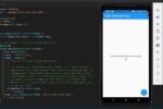
Step-1: Basic page layout:
So here we will create a basic icon button. First, we create our page body with a title. Now, in the body, we create a stateless widget. In this widget, we create a container. In this container, we will create a button.
Step-2: Create the Button:
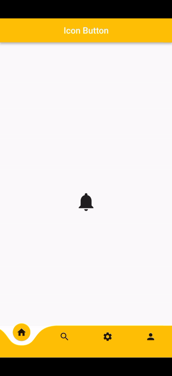
In that container, we create an Icon Button. To align it in the center, we wrap it in the center widget. This button has two main properties, icon, and onPressed. So we put a Home icon. And we left the onPressed callback null. We use the notification icon. This is a default Icon Button.
IconButton(
              icon: Icon(Icons.notifications),
              onPressed: () {},
            ),
After knowing its properties, we will create different styled buttons.
We create a basic page layout that has an App bar and a bottom navigation bar. if you don’t know how to create a bottom navigation bar or want to customize the bottom navigation bar then click the link below.

Properties of Icon Button
There are many properties. But we learn some of them. Don’t worry, with these properties, we mentioned below, we can create and customize our buttons as we want.
- alignment: This property helps us change the button’s position in the widget tree.
- autofocus:
- color: change the color of the icon.
- constraints: Optional size constraints for the button. But we can also use a container widget instead of constraints to change the size of the button.
- highlightColor: The secondary color of the button when the button is pressed.
- hoverColor: change the color of the icon when the mouse pointer hovers over it.
- icon: display the icon inside the button.
- iconSize: change the size of the icon.
- mouseCursor: show the specific type of cursor when the mouse pointer hovers over the button.
- onPressed: when you tap or press the button, the action which we want to perform.
- splashColor: a circular color area is displayed when the button is pressed.
- tooltip: when we pressed the button we can display a text with this property.
Now we create some Icon buttons to understand how their properties work.
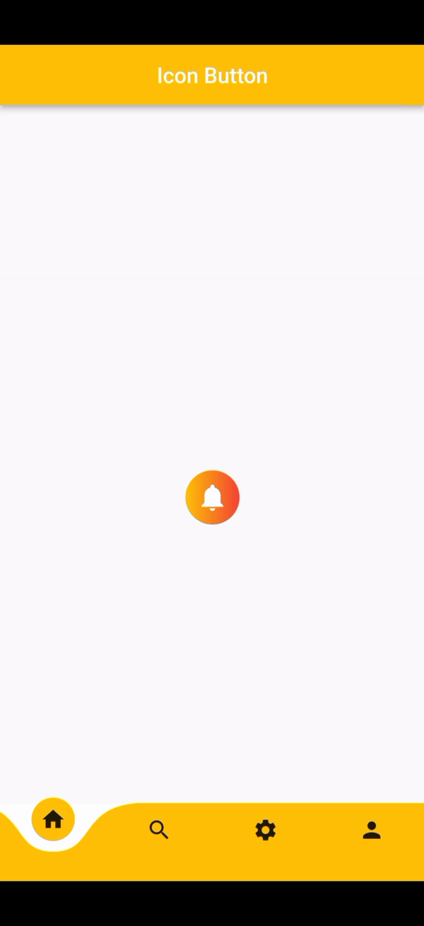
Example-1: Create a button with a Gradient background color
Container(
            height: 50,
            width: 50,
            decoration: BoxDecoration(
                borderRadius: BorderRadius.circular(50),
                gradient: LinearGradient(
                colors: [Colors.amber, Colors.red])),
            child: IconButton(
              alignment: Alignment.center,
              iconSize: 25,
              color: Colors.white,
              splashColor: Colors.amber,
              highlightColor: Colors.grey,
              mouseCursor: MouseCursor.uncontrolled,
              tooltip: "Icon Button",
              icon: Icon(Icons.notifications),
              onPressed: () {},
            ),
          ),
Here we create a customized Icon Button. At first, we wrap the button in a container. Then we define the container height and width. After that, we decorated the container. We add a gradient color and give it a border radius.
Now in the button Widget, we define its properties.
- We define its alignment property. We align the icon center in the container.
- Then we increase its size with iconSize. The default icon size is 24.0.
- We use splashColor. So that it shows color when we pressed the button.
- We don’t write any code in the onPressed property. We left it null.
- Here we create a button with the gradient background color.
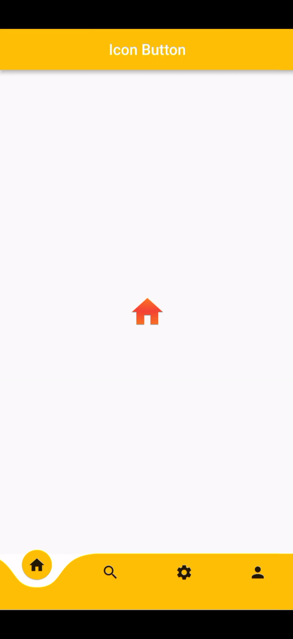
Example-2: Create a button with Gradient colored-Icon
Container(
            height: 50,
            width: 50,
            child: ShaderMask(
              shaderCallback: (Rect bounds) => RadialGradient(
                center: Alignment.topCenter,
                colors: [Colors.amber, Colors.red],
                tileMode: TileMode.mirror,
              ).createShader(bounds),
              child: IconButton(
                alignment: Alignment.center,
                icon: Icon(
                  Icons.home,
                  size: 40,
                  color: Colors.white,
                ),
                onPressed: () {},
              ),
            ),
          ),
Apply a color gradient to the icon
Now we will create an Icon Button with gradient Colored icon. Before we have done it, here we also created a button in a container widget. Thus we can’t directly color the icon with a gradient shade. So we use the shaderMask widget. In it, we can fill the icon with gradient shade. Then we create the Button as its child.
Now we create a Button with a gradient color.
Hope you enjoy this tutorial and learn some new things. If you have any queries or we make any mistake then comment to us.


you have a great blog here! would you like to make some invite posts on my blog?
Howdy are using WordPress for your site platform? I’m new to the blog world but I’m trying to get started and set up my own. Do you require any html coding expertise to make your own blog? Any help would be really appreciated!
I wanted to thank you for this fantastic read!! I certainly enjoyed every little bit of it. I have got you saved as a favorite to check out new stuff you postÖ